

Author
Ariel Luduena KarhsAriel Luduena Karhs is the CEO and co-founder of Moove It. A passionate entrepreneur and technologist, whose ability to lead development teams and implement leading-edge technologies have been a driving force behind Moove It’s success.
Big news! We’re rebranding, and with that comes a new website, logo, colors and font that reflect the success and transformation our company has experienced in the last 12 years.
Back when we started out in 2006, old-fashion software dominated the software industry, waterfall development methodology was all the rage and Nokia 1100 devices were a thing. We’ve come a long way since then.
Like the software industry, which is dynamic and ever‑changing, our brand has evolved over the years, with slight modifications to our logo, website and messaging. And while we think the current identity has carried us far, it hasn’t quite evolved in the right direction and does not represent a good foundation for the new era of our company.
Through all the past and current changes, some things have remained the same: Our commitment has always been to offer quality service, be recognized for it, and do it with the help of great people. It’s wonderful to see that those three ideas, along with the same values, are still driving our growth a decade later.
Thanks to our clients
Our clients played a vital role in the rebranding process. They helped identify our key differentiators and gave us important feedback. Not only that, several clients provided amazing written testimonies, and others invested almost a full day to be interviewed and filmed by our team. Our gratitude to them knows no bounds. We feel so proud and lucky.
Thanks to our team
This could very well have been a painful experience, and we thought it would be; after all there was a lot of emotional attachment to the current identity. But our whole team made it all so easy. They encouraged the change and give honest and valuable feedback.
Our awesome company culture made this potentially difficult process something really enjoyable, and we all embraced the change and did it together.
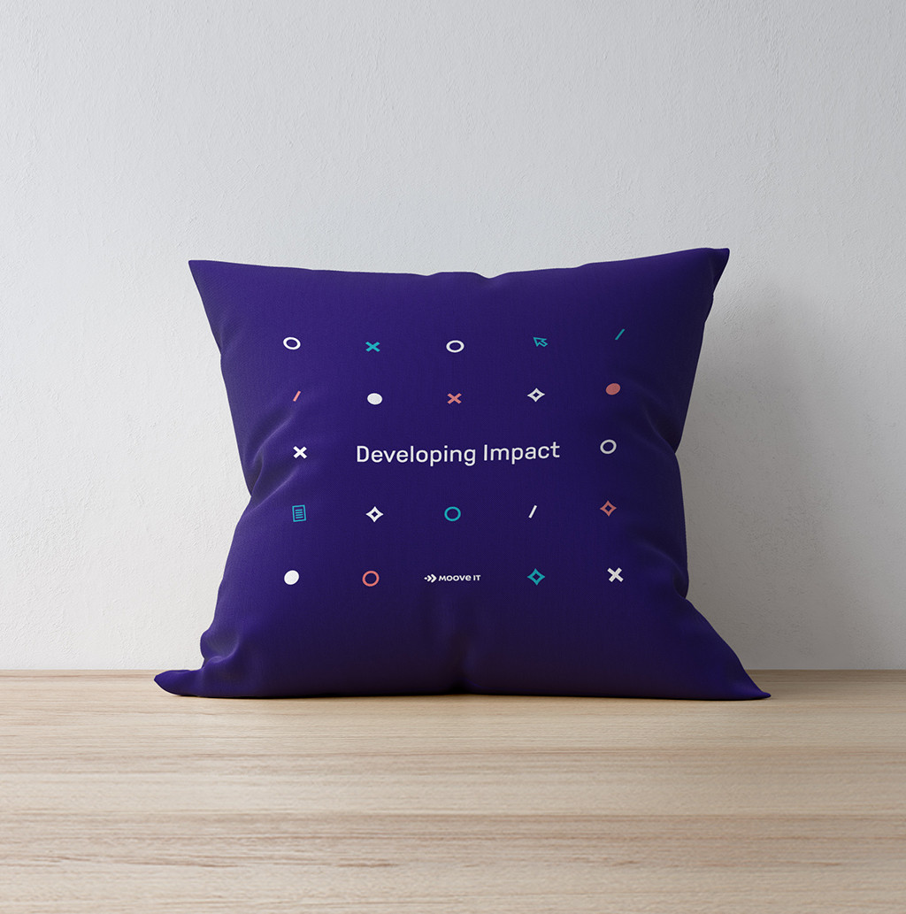
Our new tagline: Developing impact.
Our new tagline perfectly summarizes our purpose: empowering organizations to make positive global impact through high-quality digital experiences.
Moove It uses software development and design techniques as tools to make positive impacts on society. Our focus is on improving lives through digital experiences, and this concept drove our full rebranding process. It served as a guide for how we talk about our approach, experiences and success stories.

The Moove It logo
It took us seven iterations to come up with the definitive logo. It wasn’t an easy process, but in the end, it was worth it.
The plan was to build a totally different logotype and mark, while maintaining a connection with the past. Something that shows evolution. We also wanted the new logo to reflect the fact that our company is both strong and approachable at the same time.

The “M” and the “e” give the approachable touch. The “e” is the only lowercase letter and acts as a binding between the new logotype and the current one.
Logo evolution

Colors
As you may have noticed, dark blue is our new orange. The primary palette captures the majority of our color needs. White and dark blue are used as the brand canvas, to capture the majority of all visuals. The coral is used sparingly to add interest to specific areas and bring impact. The secondary palette defines three tone-on-tone values for maximum flexibility without having to double the color selection.
Primary palette

Secondary palette

Iconography
We now have a system of distinctive icons to represent different functions. Each icon is made up of three simple components. Three represents the number of forms in the mark, creating a subtle visual relationship within the system. Made up of linear elements from a square and circular elements, we have an iconography system with endless possibilities. The Moove It icon style marries together innovativeness and energy, while maintaining a polished and professional look. These new icons fit seamlessly within the brand:


The future
Moove It will continue to pour its skills and expertise into creating a sustainable future for all. Now more than ever, as we help companies develop high-quality technological products and services that change lives in meaningful ways, our commitment to making positive impacts will continue to inspire our journey.
Here’s to the future!
Ariel Luduena, CEO @ Moove It

